Project Overview
The Problem: Everyone, at some point in their lives, will have dirty windows in their home or apartment. There is no easy solution to this problem, as it is difficult for dirty window owners to find experienced washers, and experienced washers to find dirty windows to wash.
The Solution: Create a mobile app experience for window washers to easily browse dirty window requests, review request details and submit proposals.
Specifications
Platform: iOS (mobile)
Screens: Launch, Browse, Details, and Proposal
Data Available: name, address & phone, number of windows & stories, screens, needs furniture moved, parking, access to water, and photos (optional)
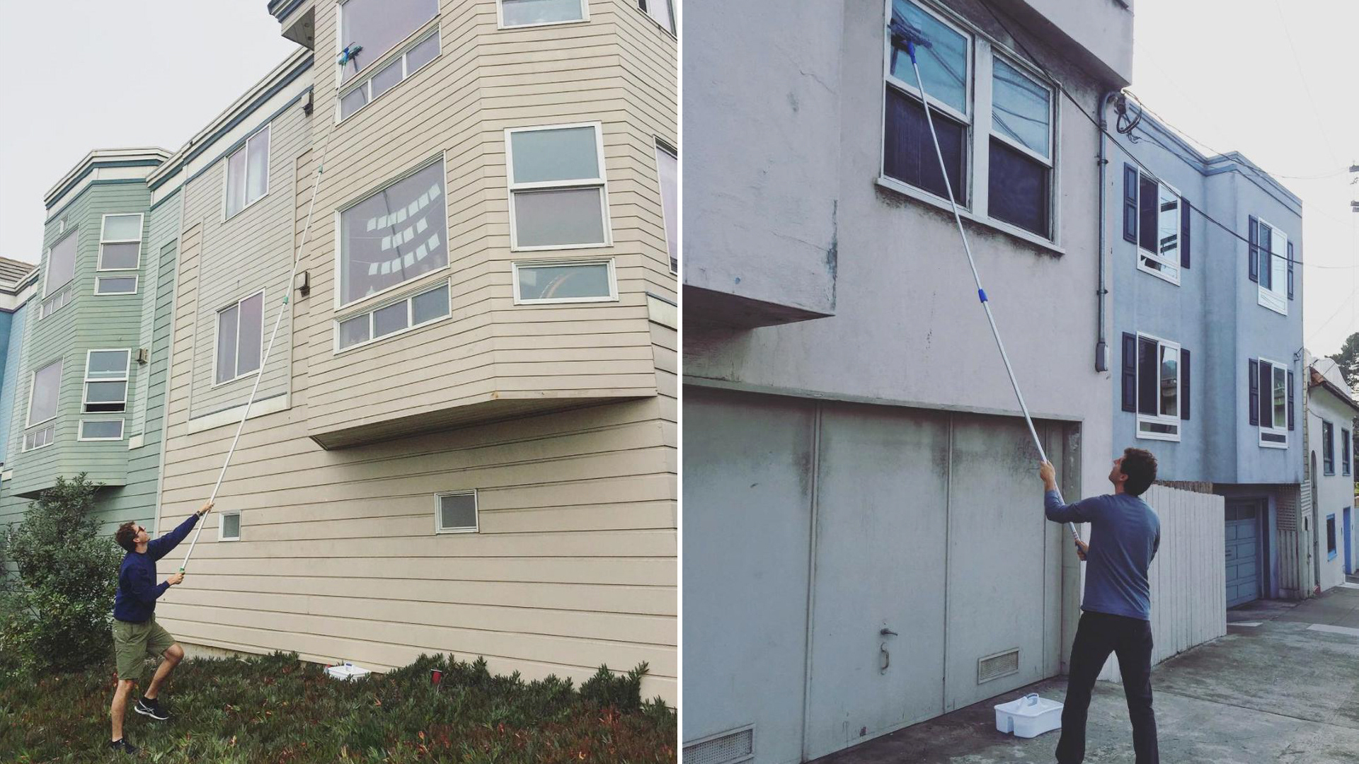
This was a good exercise because I've washed two windows in the past year
User Persona
Individual washer (not a company), returning and familiar with the app and its interface and settings.
Motivation: Find new business and make more money
Goals: Discover relevant work, negotiate and book jobs, and wash windows
User Research
Guerrilla research was conducted with six friends. They were asked two questions:
1) If you’re doing a job for someone in your area, what is most important when deciding whether to do it or not?
Answer themes: Price, distance and the more information on the person requesting.
2) In a same situation, how likely would you be to accept a recommended price for a job that you were interested in doing?
Answer themes: Likely, but it ultimately depends on the job specifics. There is doubt that the app can take into account all the nuances of the job to provide a very accurate price.
Product Goals & KPIs
Primary Goal: Drive proposal submissions
KPI: Total request views and submissions
Secondary Goal: Encourage use of the recommended price
KPI: Usage of price vs. custom price
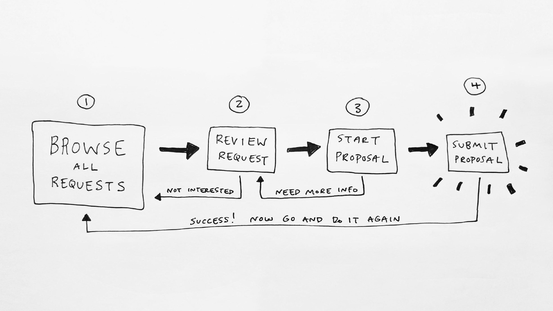
Sketch of the user flow from request review to proposal
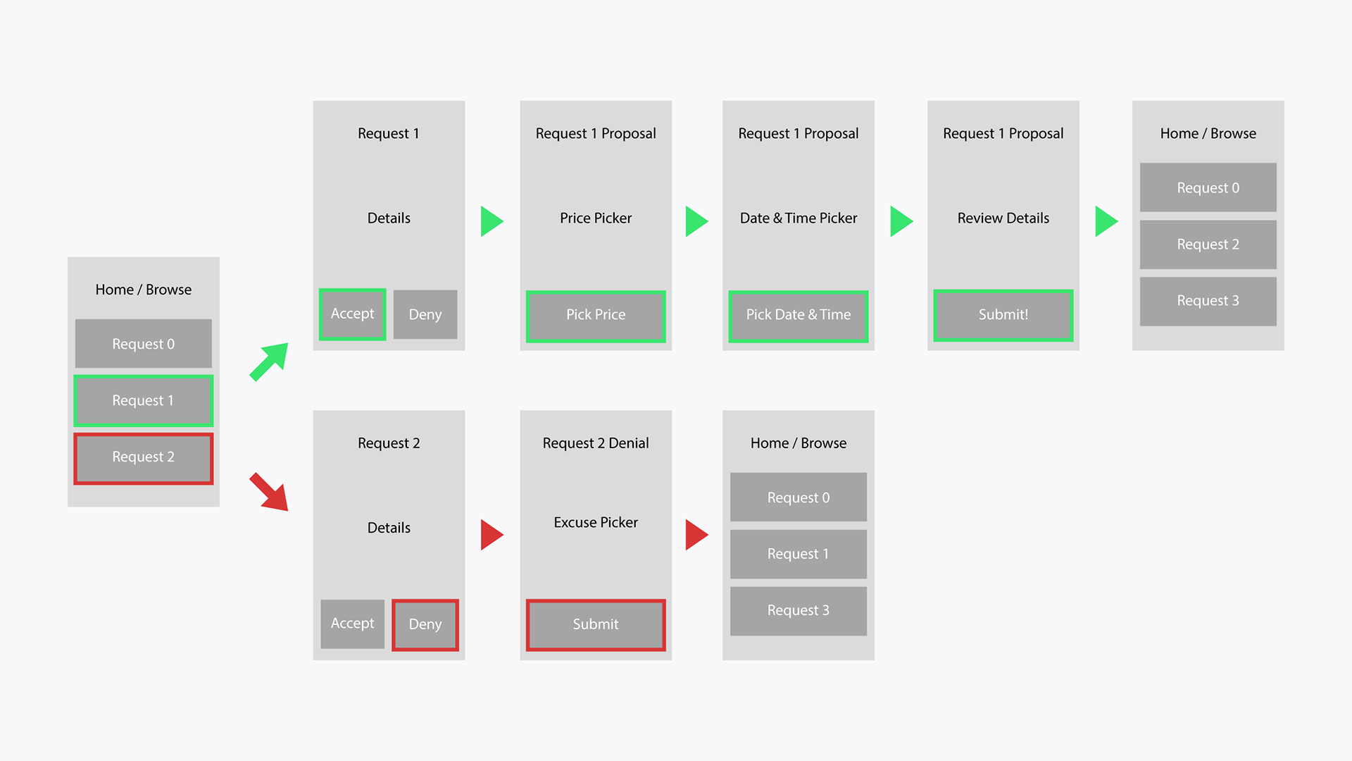
User flow wireframes from request review to proposal or denial
Design
Card components: Clearly defined groupings of information for easy browsing
Bright and bold colors: The blue and white exudes cleanliness and the sky outside a window
Clear hierarchies: Present information in two ways: at-a-glance and in-depth
Modals: Use of pop-ups to control the user focus when selecting price, date and time
Inspiration & Best Practices
Booking services: TaskRabbit, Airbnb, Priceline, Google Flights
Design systems: Google Material, Shopify Polaris, Airbnb Design
Mobile-specific components: Sliders, date/time pickers, cards
Best practices: Card and F-pattern design, WCAG color contrast
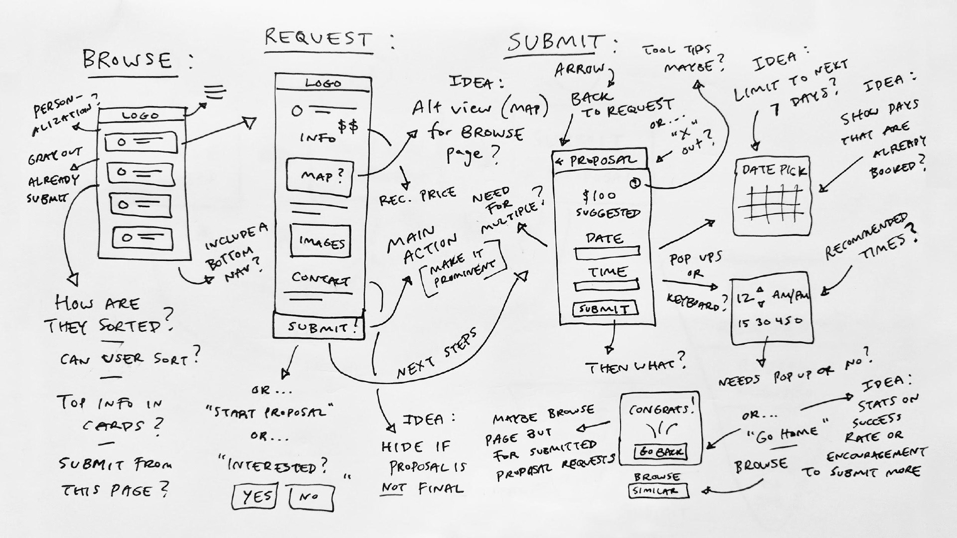
Initial brainstorming and doodling for the app screens
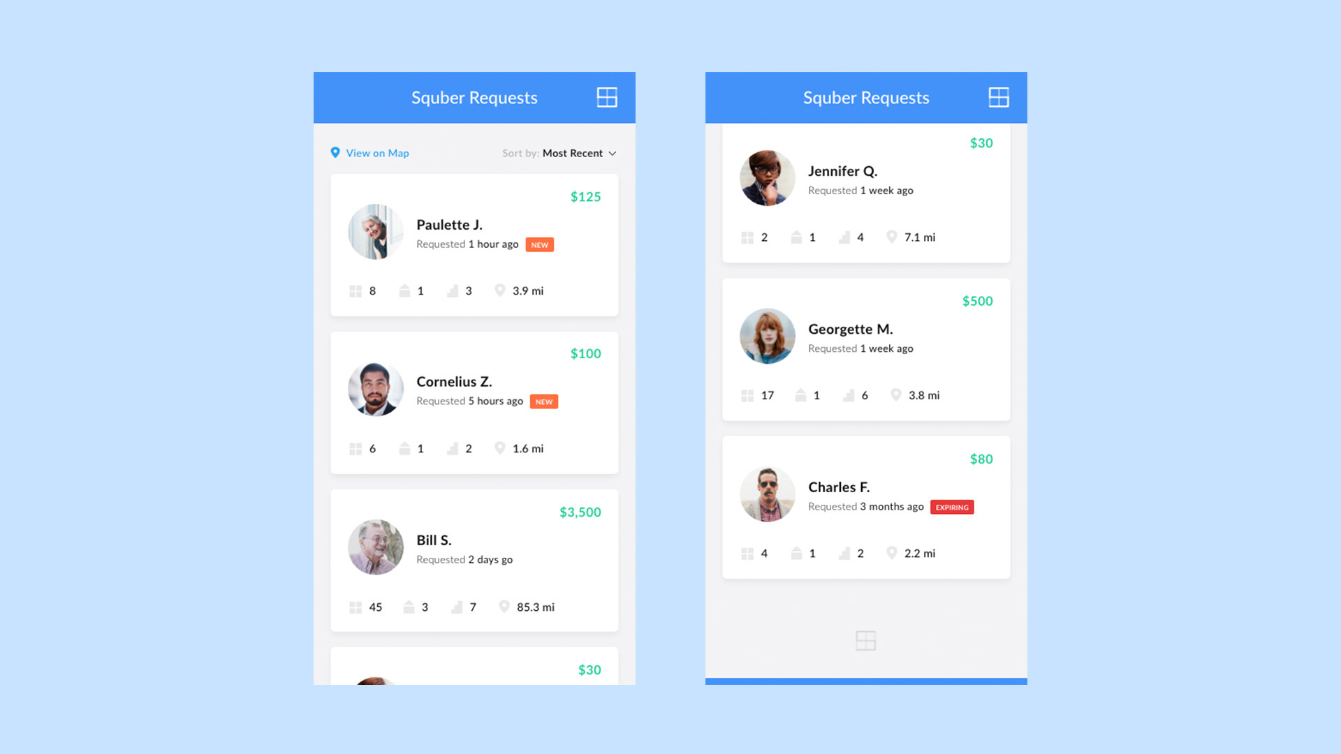
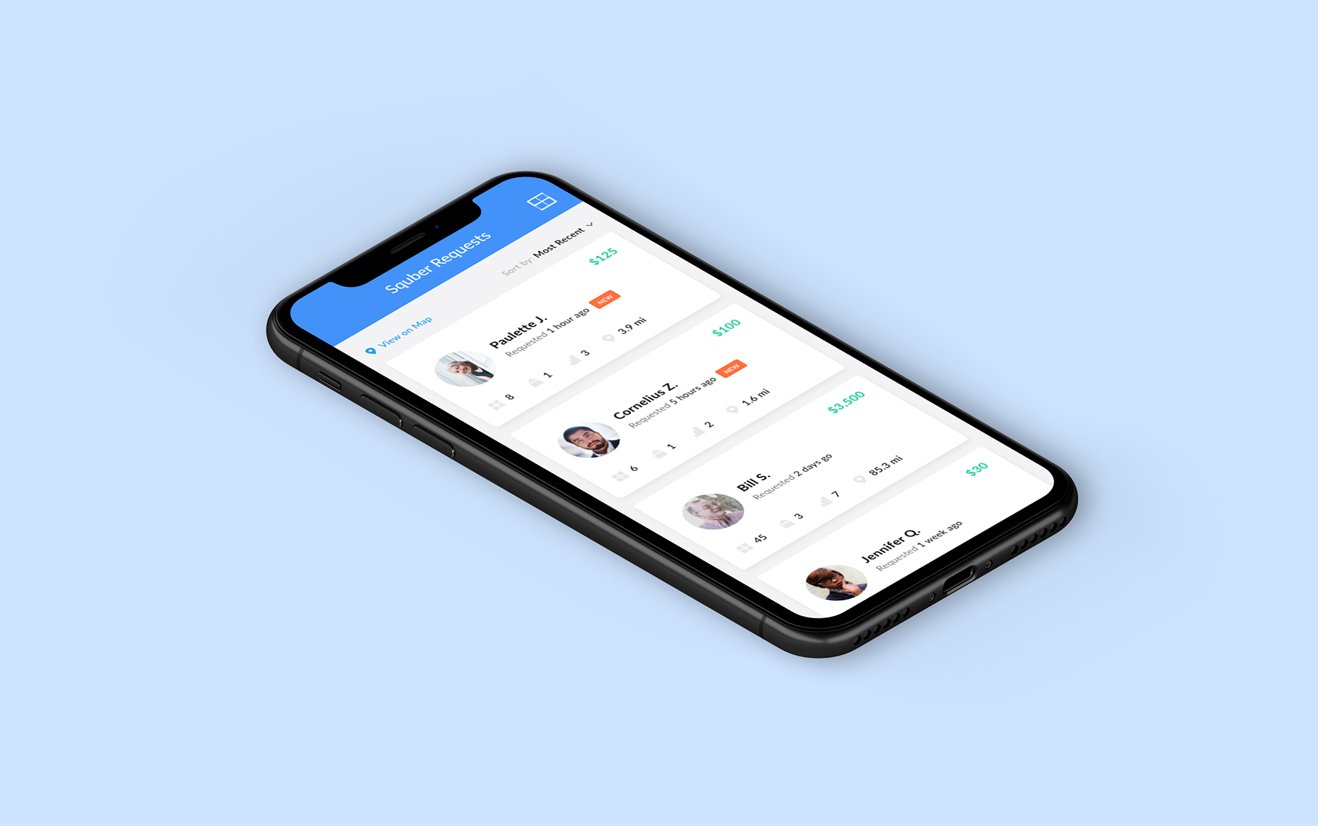
The request page is a feed of potential jobs with top-level, at-a-glance information
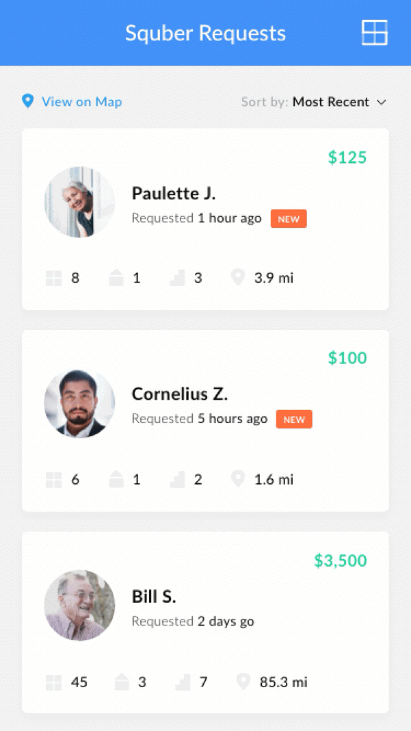
Scroll animation on the request page with a persistent navigation bar
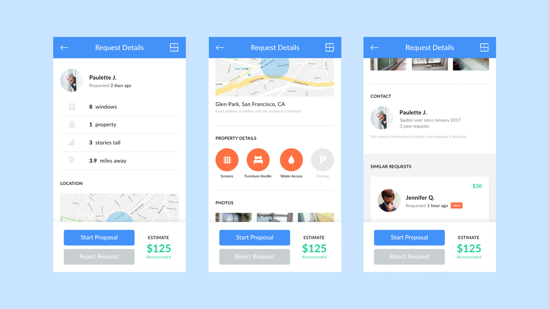
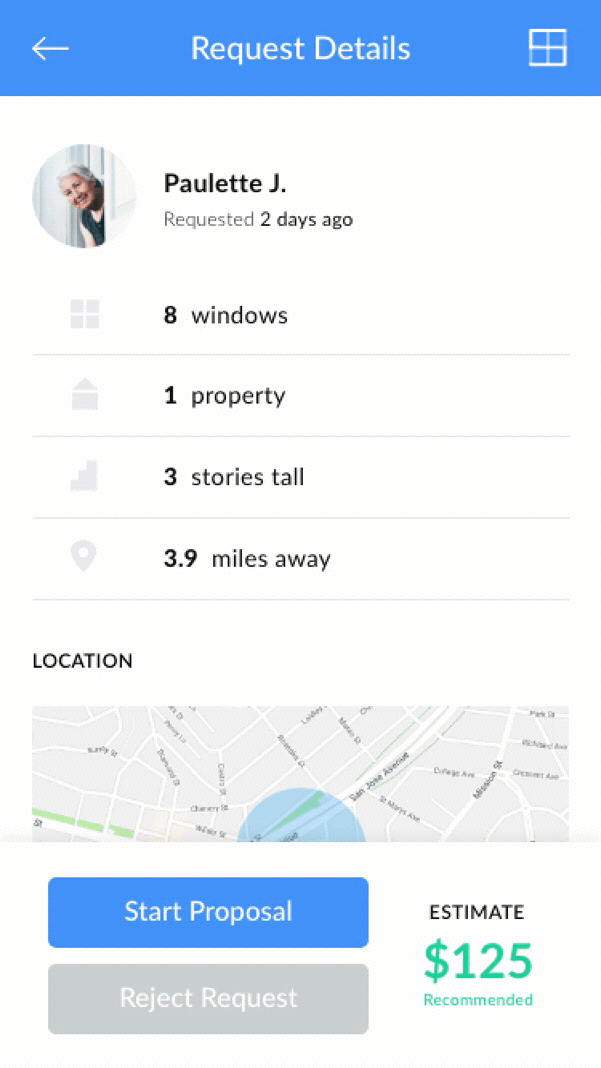
Request details page with the snapshot, location, property details, photos, contact info and similar requests
Scroll animation on the request details page with the proposal CTA anchored at the bottom
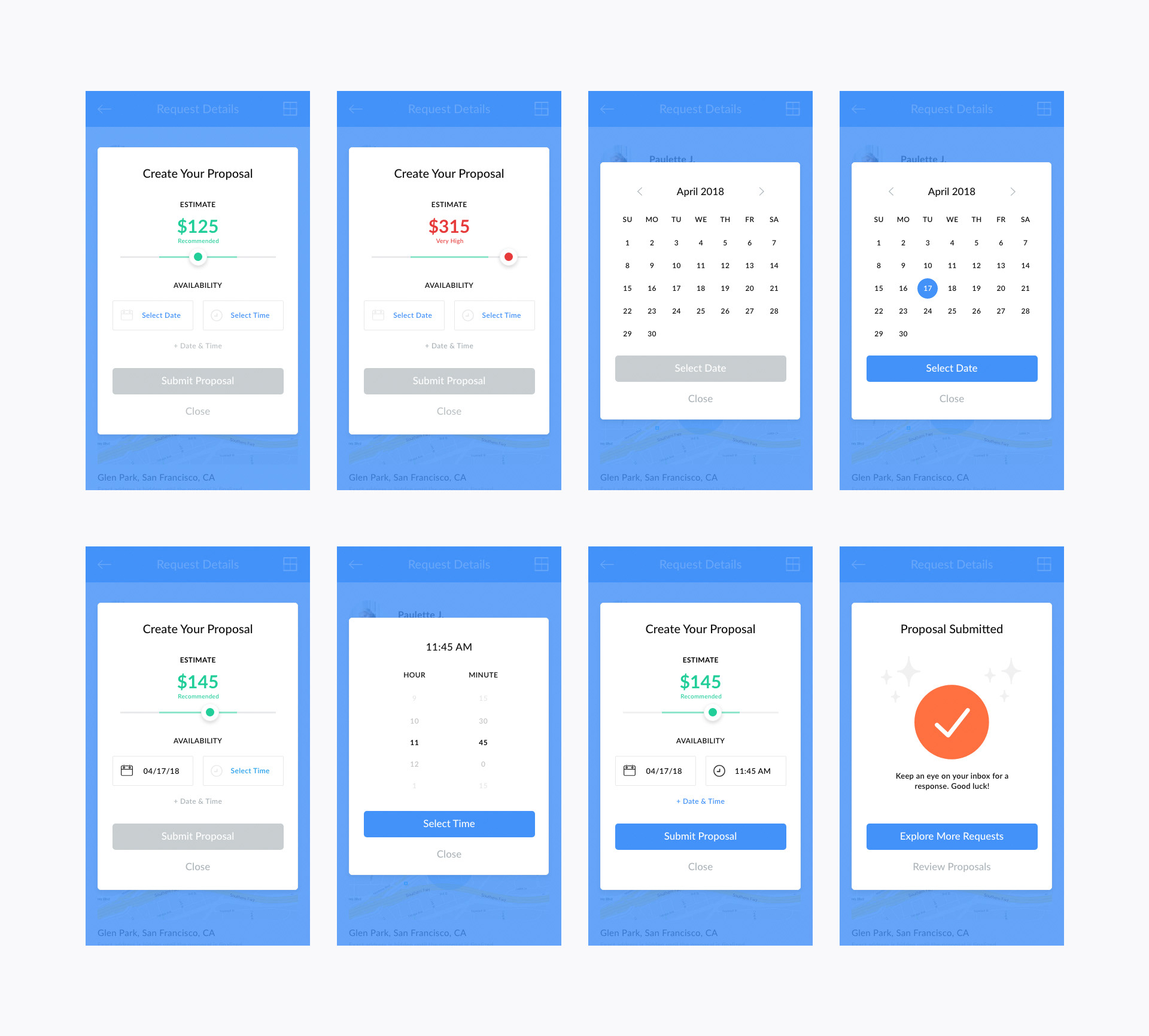
Proposal modal flow: Enter the price, day and time, then submit and explore more options
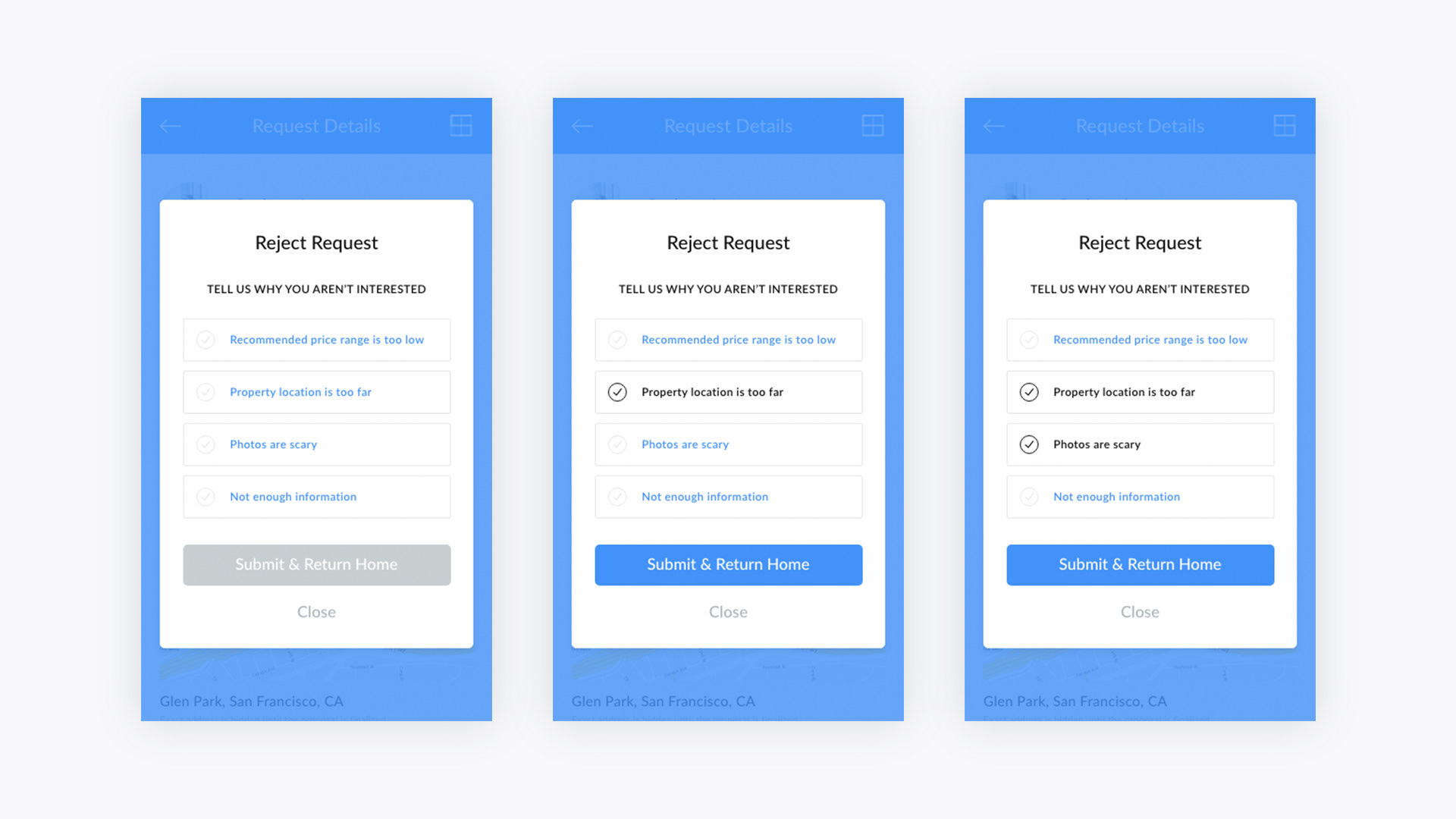
If a user rejects a request, they are asked to explain why
Final Thoughts
Edge cases (no results, too many results, recommended price disparities) were an afterthought but could change some of the design decisions.
Visualizing proposals to jobs ratio could have helped emphasize submission or caution washers of over-submitting.
It would have helped to better understand the users: what’s important to washers (price, windows, etc) as well as time sensitivity on requests.
Appendix: Design Tools
Brainstorming: Pen and paper
Research: Dribbble, Behance, Medium, Google
Design: Adobe XD
Accessibility: Contrast
Animation: Principle